
How Creativity Can Kill a Good Website DesignB
You started designing because you’re probably more creative than the average person. How in the world could being too creative kill your design?
I always thought the more creative someone is, the better designer he or she must be. Then, I started studying design more and realized that it’s not all about creativity at all.
What got you here, won’t get you there. This is so true for designers as well. Most of us start as visual designers, and then we grow and learn more about user interface, conversion, user experience, accessibility, or usability.
Your creativity brought you here and that made you interested in design, but if you really want to evolve and become a better designer, be aware that being too creative may actually hurt your design work.
How?
Because we’re designing for users. The sooner you realize this, the better. User psychology is a complicated subject, but one thing is for sure: people by default are lazy and will look for the least resistant way to accomplish their task.
Too-complicated layouts, too-creative solutions and reinventing wheels won’t make your users’ life easier.
So, how can we find a good balance between a creative, artistic, and original design while still making it intuitive, without losing usability yet still providing good results for the business?
Start with a prototype in mind
According to Google’s research, users prefer websites that look both simple (low complexity) and familiar (high prototypicality).
People make their aesthetic judgment on your design in less than 50 milliseconds. That first impression can tell them if they want to stay or leave your website or how they feel about your brand and product.
“Designs that contradict what users typically expect of a website may hurt users’ first impression and damage their expectations.”
~ Javier Bargas-Avila, Senior User Experience Researcher at YouTube UX Research
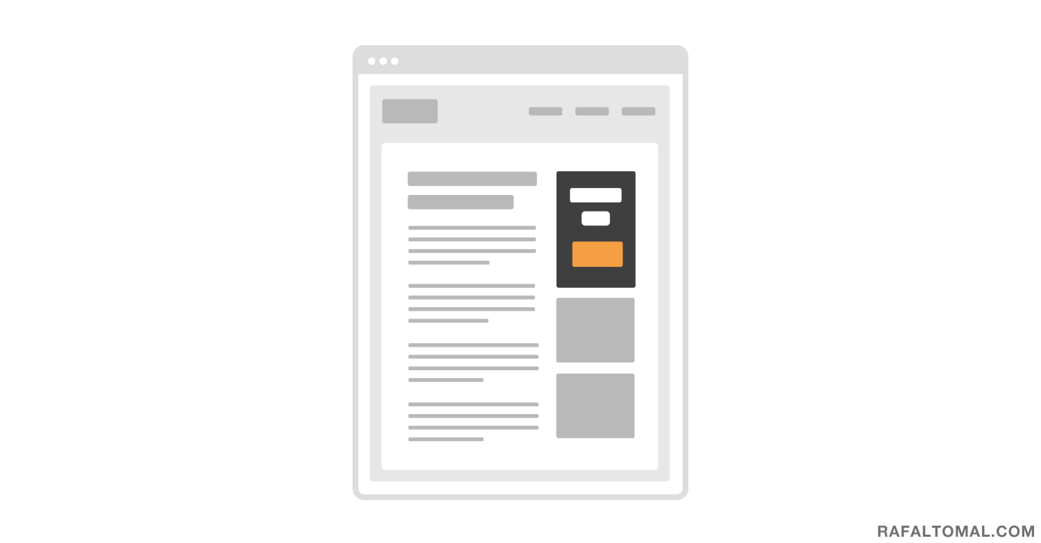
You’ve probably seen thousands of different websites by now. If I asked you to draw a layout of a blog website, it would probably look something like this:
We could repeat this exercise with almost every kind of website: e-commerce, a doctor’s office, university, portfolio, magazine, etc.
A prototype of a blog website has the content area on the left side and the sidebar on the right side. The sidebar has “widgets” that mostly includes the email sign-up form as the first one.
Does every blog look like that? No, but most of them do and that’s why this is a prototypical image of a blog layout.
When people visit your blog and want to sign up for your email newsletter, their expectation will be to find it in the right hand sidebar. How convenient is it when they find it right there and how frustrating would it be if it’s not there?
I believe it’s always good to start designing with a prototype in mind. Then, you can alter it from there and test different ideas and decide how much you can afford to change the original look.
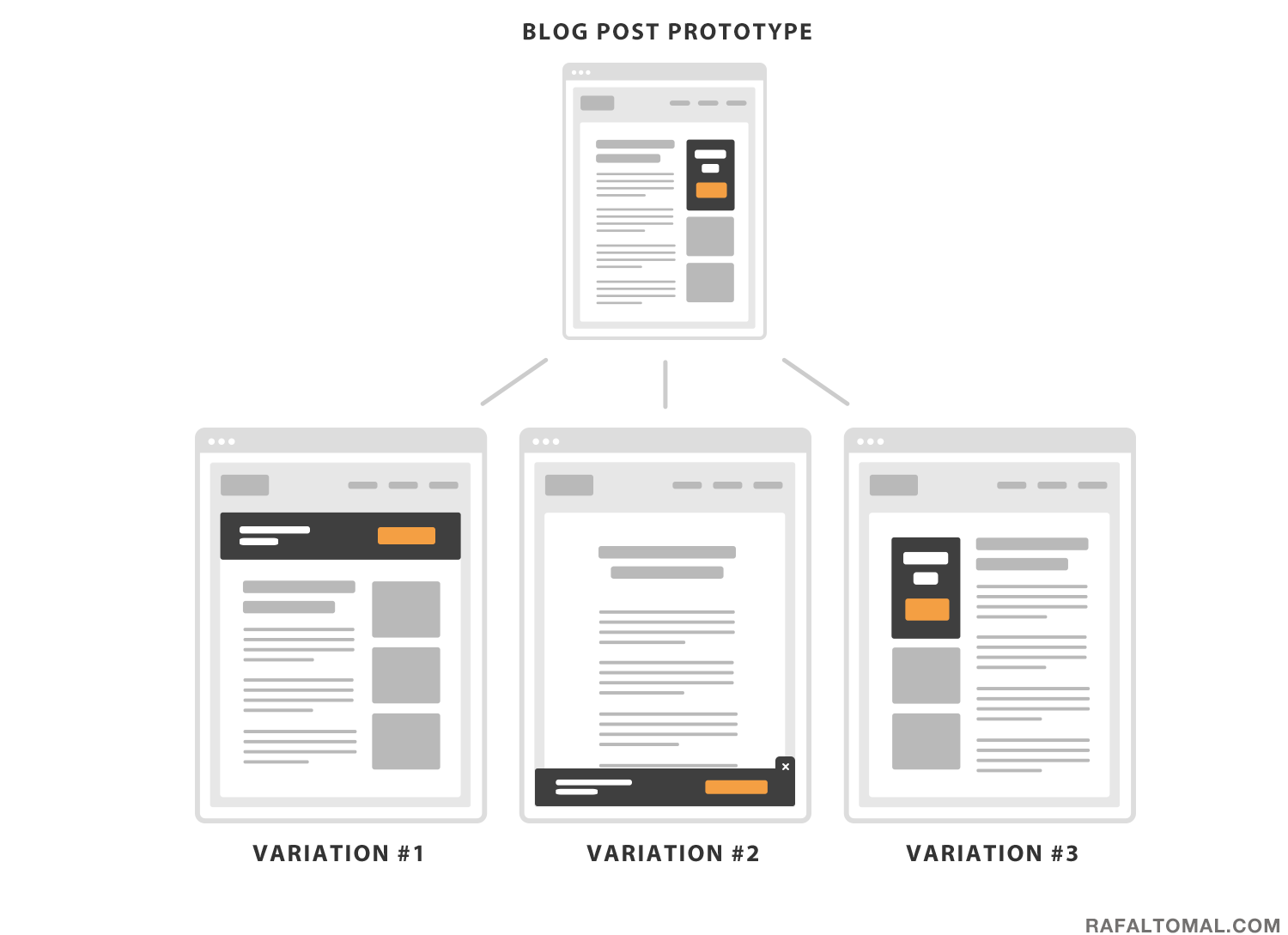
Of course, everything depends on your targeted audience. If you’re designing a website for creative people, their expectations may be completely different. Looking at a prototypical website could be too boring for them and they may actually be open to a more creative approach from you.
On the other hand, if you’re designing for a non specified group of users, you may want to go a safer route and stick as close to the prototypical design as possible. Being too creative here could actually hurt the basic expectations, which would lead to confusion and result in abandoning your website.
Don’t make your users think
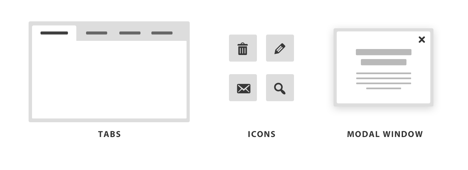
There are many early established web conventions and standards like the placement of your logo, navigation, search bar or login link. There are even conventions on an icon’s meaning, website element names, (e.g. Home, Sitemap, Contact), button styles, layout and visual hierarchy.
All of these standards will help your users to navigate and find what they need much faster. Try to always stick to some of the most popular conventions and use your creativity elsewhere.
Avoid reinventing the wheel. You don’t want to change your users’ expectations from where the navigation is or make them wonder what that icon means. Remember that users are looking for the least resistant way to accomplish their task. So, simply don’t make them think.
Every website has its own level of user interface complexity and its amount of content. The more complex your interface is and the more content you have, the more energy it requires from visitors to explore the website.
There are some exceptions when you may want to break the web conventions on purpose. Maybe you know exactly who your audience is and the goal of your website is to entertain and create an environment when your users are having fun exploring your creative ideas.
You’ve probably seen many clever portfolio websites with an original navigation or a horizontal scroll instead of vertical. It is fun to explore these and I’m sure all other designers enjoy it too. It is OK in this circumstance.
Similar creative approaches certainly wouldn’t work for a local library or hospital website, where many users are older people or less experienced web users and they don’t have time or energy to play with your design.
Again, I would strongly recommend to start designing with the conventions in mind, and then try to alter some elements and test them first.
Don’t just trust your own gut – see what your users think. If you can afford to come up with completely new design solutions, then you should be able to afford to test the usability of that solution as well.
Use your creativity mostly in visual design
So, where is the fun part of designing websites if you can’t be too creative in many of the previously mentioned aspects?
You can be and should be creative when it comes to the visual design. Try different color schemes or interesting font combinations. You can play with spacing, visual balance and hierarchy. Design original illustrations or clever hover and scrolling effects.
Look for creative ways to simplify your design. Minimalism is not about hiding features or content, but about doing less, better. Yes, actually simplifying design very often needs more creativity than making it complex.
Help your users to complete the same tasks in a shorter time using fewer steps. Come up with creative ways to solve your users problems or to increase the conversion rate by breaking your visual patterns and directing your users right into your call-to-action.
There is so much room for creativity in these areas while still sticking to design conventions, standards and common website prototypes.
Don’t get me wrong – be creative and have fun designing websites. Just be careful how and where you use your creativity so it won’t work against you.