What’s new in Material Design?
All the new things announced at Google I/O 2018.

Since the launch of Material Design in 2014, it has been the most used(and loved) visual design language! This is because of two main reasons:
- Unification: Visual language which works across the platform.
- Intuition: Core principle of Material Design is how “Material / Surface” behaves. This makes it almost obvious to the user what will happen on the interaction.
But Google wants Material Design to be much more than just another Visual language. Google is building tools to improve our design-development workflow! Here are the big announcement made in this year’s Google I/O:
Material Theming
This is a huge upgrade to Material Design! Material Theming is the ability to “systematically” customize Material Design to better reflect your product’s brand. Let me explain what systematically means here:
The brand is represented visually by colors, typography and shapes.
So we need a way to change these things in Material Components, too!
Earlier to make such changes we had to use multiple plugins to update Sketch symbols/library, but now we have “Material Theme Editor”.

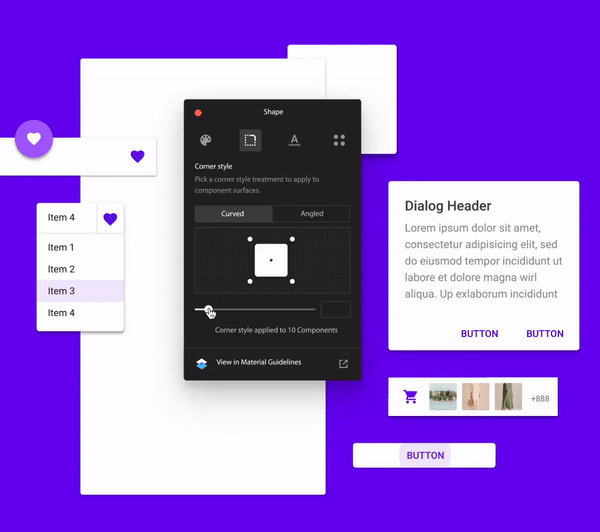

Some cool features:
- Change/add/update Colors: What’s cool about this is, it can understand where the color is being used and accordingly generates shades/tints.
- Typography management: This allows you to create the type hierarchy which is visually similar!
- Shapes: This is something new and the core of material design as this is about updating the material(card/shape)! You can define custom shape based on your brand.
- New icon styles: Are you like me who was irritated with a limited choice of icons and solid style? Well, now we have 5 different styles of icons.
Gallery
Do you guys remember this from last year? This was a tool Google launched claiming this will streamline your design workflow, but all it could do is allow users to comment on image versions!
Google’s Gallery is back with the bang! Now it offers features which will definitely solve your design handoff headache. Let’s see what it can do.
- It allows attaching Google Doc, Sheets and Slides! So we can put everything from requirement document, user research to designs in a single place!
- It has the concept of “Project and Collections”. Which is similar to our Sketch file and having multiple pages! Such a huge thing for me.
- If you upload a file with the same name, it will create versions of that file. This is helpful to see how your wireframes turn into real designs. Or just to see how feedbacks are shaping your UI.
- Inspect Mode (Showstopper?): Specification generator! Not an ordinary one, It can detect symbols and shows you links to code for that component! Also, it can identify font family and shows the link to Google fonts!
- And of course, it’s free! No more Sketch Measure, Zeplin, Marvel or Invison (Sorry guys!)
Other major updates
- Material Components for iOS, Android, web, and Flutter:
2. How Google created a custom Material theme: explains how Google is treating their Material Design rules.
3. Material partner studies: Learn how apps like Lyft, Genius, NPR, Pocket Casts, and Zappos bring Material’s new expressive capabilities to life.